5 Font Mistakes To Avoid & 10 FREE Fonts


Choosing and using the right fonts with your artwork can really make or break a design. For me, it’s one of the hardest decisions to make when it comes to creating a graphic design that requires text. It is so easy to make mistakes when you are just starting out. For all you budding designers out there, here are 5 font mistakes you should avoid.
5 Font Mistakes You Might Be Making
1) Using Too Many Fonts
Combining fonts can be a lot of fun, but it can be addicting! Once you start playing around with them you find so many combinations that you think really work together. But hold up! You can definitely take it too far. Too many different fonts can make your design look disjointed and cluttered.
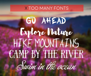
Instead, try to pick two or three fonts that work well together.
2) Using Outdated or Overused Fonts
You’ve finally completed your design masterpiece and now it’s time to add in your text. Do yourself a favor and stay away from the “old favorites” like Comic Sans, Papyrus, Curls MT. These fonts can bring even the best designs down. When you use dated or overused fonts it makes your design look banal.
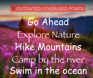
Instead, do some searching and find a more visually pleasing font choice. There are plenty out there. Don’t limit yourself to default fonts.
3) Font Style Clashes With Design
Make sure your font choice compliments your design or band. Don't put some cute girly curly-q font with a Big Mike's Ride or Die Motorcycle Club logo. Okay, so that's a really drastic example, but I think it get's the point across.
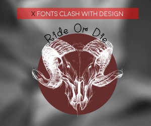
Instead, think about the style of your design or brand. Is it feminine and fun? Is it clean and professional? Is it rugged and rustic? Spend some time finding the right style fit for your design to achieve a more cohesive finished product.
4) Fonts Clash With Each Other
As we discussed before, mixing and combining fonts can be a lot of fun. However, the fonts need to both compliment each other and have contrast to be successful. The fonts should not be too alike or too different.
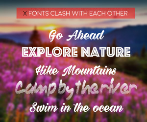
Instead, if it doesn't look quite right, keep playing around! Try matching something sweet with something rustic. Try matching something fancy with something simple. Sometimes unlikely suspects match well together. The more you play around with combining fonts, the better you will understand what pairs work well together.
5) Lack of Variety
Just as you can use too many fonts, you can also use too few. This is usually only a problem when there is a large amount of text. Let’s say you want to create a graphic quote. If the entire thing is all one font, it won’t be very visually engaging.

Instead, try breaking up the text with a different font style or graphic imagery. I will admit, sometimes you can get this to work and look nice, but most of the time it's pretty boring.
10 Free Font Downloads
It can be a challenge to find free fonts that are high quality. We know it can also be super time consuming. That's why we have carefully curated 10 free high quality fonts to help you get started, or to add to your font collection. All of these fonts were chosen from different artists on Behance. ENJOY!
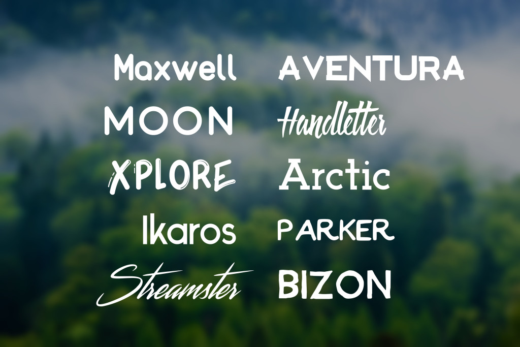
You can download any or all of the fonts shown above by clicking on their names below!
Maxwell | Moon | Xplor | Ikaros | Streamster | Aventura | Handletter | Arctic | Parker | Bizon
The download links will be in different places on each page - usually either at the top or bottom of the page.
Note: Only some of the fonts listed above are free for commercial use. If you'd like to see an awesome collection of fonts that are free for commercial use, check out our Top 25 Free Commercial Fonts For T-Shirt Designs
. .